Code
library(plotly)
library(ggplot2)
library(dplyr)
library(forcats)
library(tidyr)

players <- read.csv("data/NBA_players_2023-2024csv.csv")
teams <- read.csv("data/NBA_team_2023-2024csv.csv")library(plotly)
library(ggplot2)
library(dplyr)
library(forcats)
library(tidyr)
players <- read.csv("data/NBA_players_2023-2024csv.csv")
teams <- read.csv("data/NBA_team_2023-2024csv.csv")plot_ly(
data = players,
x = ~`X3PM`,
y = ~`FGM`,
z = ~`FP`,
hoverinfo = 'text',
text = ~paste(
"Player: ", players$Player,
"<br>3-Point Made: ", `X3PM`,
"<br>Field Goals Made: ", `FGM`,
"<br>Fantasy Point: ", `FP`
),
mode = "markers",
marker = list(size = 2)
) |>
add_markers() |>
layout(
title = "Correlation between Shooting Percentages and Fantasy Point",
scene = list(
xaxis = list(title = "3-Point Made"),
yaxis = list(title = "Field Goals Made"),
zaxis = list(title = "Fantasy Point")
)
)Fantasy point is a measurement of a player’s value during a single game. From the team win rate correlation analysis, we saw that 3-point accuracy and field goal accuracy have a positive correlation with team win rate. Then two questions come to us: on a personal level, how much do average 3-points made and field goals made correlate to the average fantasy points of the players; do 3-points made and field goals made positively correlate with one another?
We can first observe that 3-points made and field goals made weakly positively correlate. Moreover, the data show a triangular shape, where there are many players who have high field goals made but low 3-points made. This result is intuitive as many of these players are power forward and center players. Moreover, it also makes sense that none of the players have high 3-points made but low field goals made. This is why the distribution is triangular.
We can also observe that field goals made have an extremely strong correlation with fantasy points, which is likely due to points made being a key factor in fantasy points. The data distribution of 3-points made against fantasy points, on the other hand, is more interesting. It is weakly positively correlated. The data distribution is triangular, where many players have lower 3-points made while having high fantasy points, such as Embiid and Jokic, which shows that making 3-point shots is not deterministic in fantasy points. However, on the other hand, none of the high 3-point makers are ranked low in fantasy points, as we can observe from the plot. Without observing that none of the players have high 3-points made with low field goals made, we might speculate that the fantasy point system is in favor of 3-point makers to some degree. Now we know that none of the high 3-point makers are ranked low in fantasy points, likely due to the fact that none of the players have high 3-points made with low field goals made.
team_mapping <- data.frame(
  TeamAbbreviation = c("PHI", "DAL", "MIL", "OKC", "NYK", "PHX", "BOS", "CLE", "SAC", "GSW",
                       "DEN", "MIN", "ATL", "LAL", "MEM", "CHI", "CHA", "LAC", "UTA", "NOP",
                       "DET", "POR", "ORL", "BKN", "WAS", "IND", "SAS", "HOU", "MIA", "TOR"),
  TeamFullName = c("Philadelphia 76ers", "Dallas Mavericks", "Milwaukee Bucks", "Oklahoma City Thunder",
                   "New York Knicks", "Phoenix Suns", "Boston Celtics", "Cleveland Cavaliers",
                   "Sacramento Kings", "Golden State Warriors", "Denver Nuggets", "Minnesota Timberwolves",
                   "Atlanta Hawks", "Los Angeles Lakers", "Memphis Grizzlies", "Chicago Bulls",
                   "Charlotte Hornets", "LA Clippers", "Utah Jazz", "New Orleans Pelicans", "Detroit Pistons",
                   "Portland Trail Blazers", "Orlando Magic", "Brooklyn Nets", "Washington Wizards",
                   "Indiana Pacers", "San Antonio Spurs", "Houston Rockets", "Miami Heat", "Toronto Raptors")
)
players_with_fullnames <- merge(players, team_mapping,
                                by.x = "Team", by.y = "TeamAbbreviation", all.x = TRUE)

players_with_wins <- merge(players_with_fullnames, teams[, c("Team", "WIN.")],
                           by.x = "TeamFullName", by.y = "Team", all.x = TRUE)

players_with_wins <- players_with_wins |>
  mutate(Team = fct_reorder(Team, WIN., .desc = TRUE))

ggplot(players_with_wins, aes(x = Team, y = PTS)) +
  geom_boxplot(color = "black", alpha = 0.7) +
  labs(
    title = "Distribution of Points by Team Ranked by Win Rate",
    x = "Team",
    y = "Points"
  ) +
  theme_minimal() +
  theme(
    axis.text.x = element_text(angle = 45, hjust = 1),
    plot.title = element_text(hjust = 0.5)
  )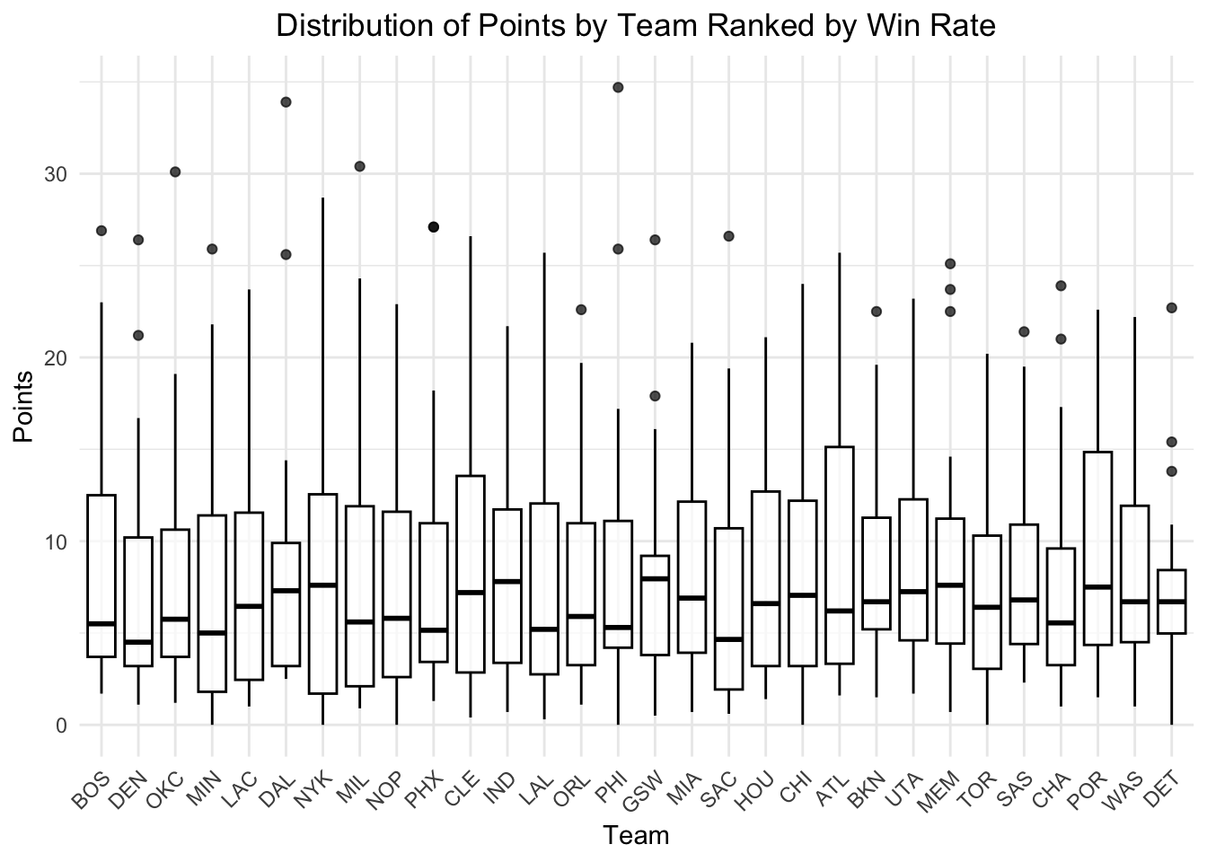
We know that the most important reason for a team to win is for the team to score points. We made a points distribution plot for all teams, ranked from the highest win rate to the lowest win rate.
We initially suspected that there might be a pattern in the distribution of points earned per player for high win rate teams, such as having a higher upper quantile, more outliers, or higher outlier points (star players). However, none of these patterns were found. Distributions differ across teams, but points distribution statistics don’t seem to show a general trend for high win rate or low win rate teams.
However, there is another interesting fact found in this plot: teams either have a high upper bound or high outlier data. The players with the most points on the team earn twice as many points as 75 percent of the players on the team. While this can be due to some players being benched for most of the time, it still raises the question: do some players attempt much more shots than other players? This is what we will discover with the next plot.
ggplot(players, aes(x = FGA / Min)) +
  geom_density(aes(fill = "FGA/Min"), alpha = 0.5, color = "blue") +
  geom_density(aes(x = X3PA / Min, fill = "X3PA/Min"), alpha = 0.5, color = "red") +
  labs(
    title = "Distribution of Field Goals and 3-Points Attempted Per Minute",
    x = "Attempts Per Minute",
    y = "Density",
    fill = "Metrics"
  ) +
  scale_fill_manual(
    values = c("FGA/Min" = "blue", "X3PA/Min" = "red"),
    labels = c("FGA/Min" = "Field Goals Attempted", "X3PA/Min" = "3-Points Attempted")
  ) +
  theme_minimal() +
  theme(
    plot.title = element_text(hjust = 0.5),
    legend.position = "top"
  )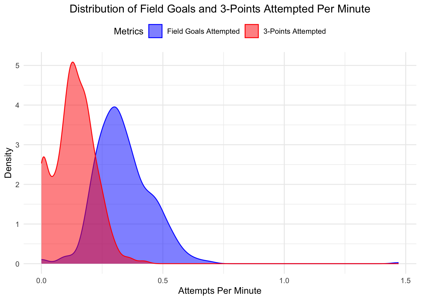
From the distribution of field goals attempted per minute for all players, we can answer the question: do some players attempt much more shots than other players? The answer is likely yes. We can see that the distribution is slightly right-skewed for field goals attempted, which indicates that some players are attempting more shots per minute than others.
For the 3-point attempts per minute, we can see that the distribution is bimodal, with one peak close to 0 and another peak around 0.125. My speculation is that some players, such as power forwards and centers, have fewer opportunities to shoot 3-pointers.
Overall, it is also interesting to observe that the peak of the field goal attempts distribution is only about twice the peak of the 3-point attempts distribution, which indicates that about half of the field goal attempts are 3-pointers.
regular <- read.csv("data/NBA_players_2023-2024csv.csv")
playoffs <- read.csv("data/NBA_players_playoffs_2023-2024csv.csv")combined_data <- inner_join(regular, playoffs, by = "Player", suffix = c("_Regular", "_Playoff"))
key_vars <- setdiff(names(combined_data), c("GP_Regular", "W_Regular", "L_Regular", "Team_Regular","GP_Playoff", "W_Playoff", "L_Playoff", "Team_Playoff", "Age_Regular", "Age_Playoff","X_Playoff","X_Regular"))
filtered_data <- combined_data |>
select(all_of(key_vars))density_data <- filtered_data %>%
select(X..._Regular, X..._Playoff) %>%
pivot_longer(
cols = everything(),
names_to = "Stage",
names_pattern = "X..._(.*)", # 提取阶段名称
values_to = "Value"
)
ggplot(density_data, aes(x = Value, fill = Stage)) +
geom_density(alpha = 0.6) +
labs(
title = "Density Distribution: Regular vs Playoff",
x = "Value",
y = "Density",
fill = "Stage"
) +
scale_fill_manual(values = c("Regular" = "skyblue", "Playoff" = "orange")) +
scale_x_continuous(limits = c(-20, 20)) +
theme_minimal()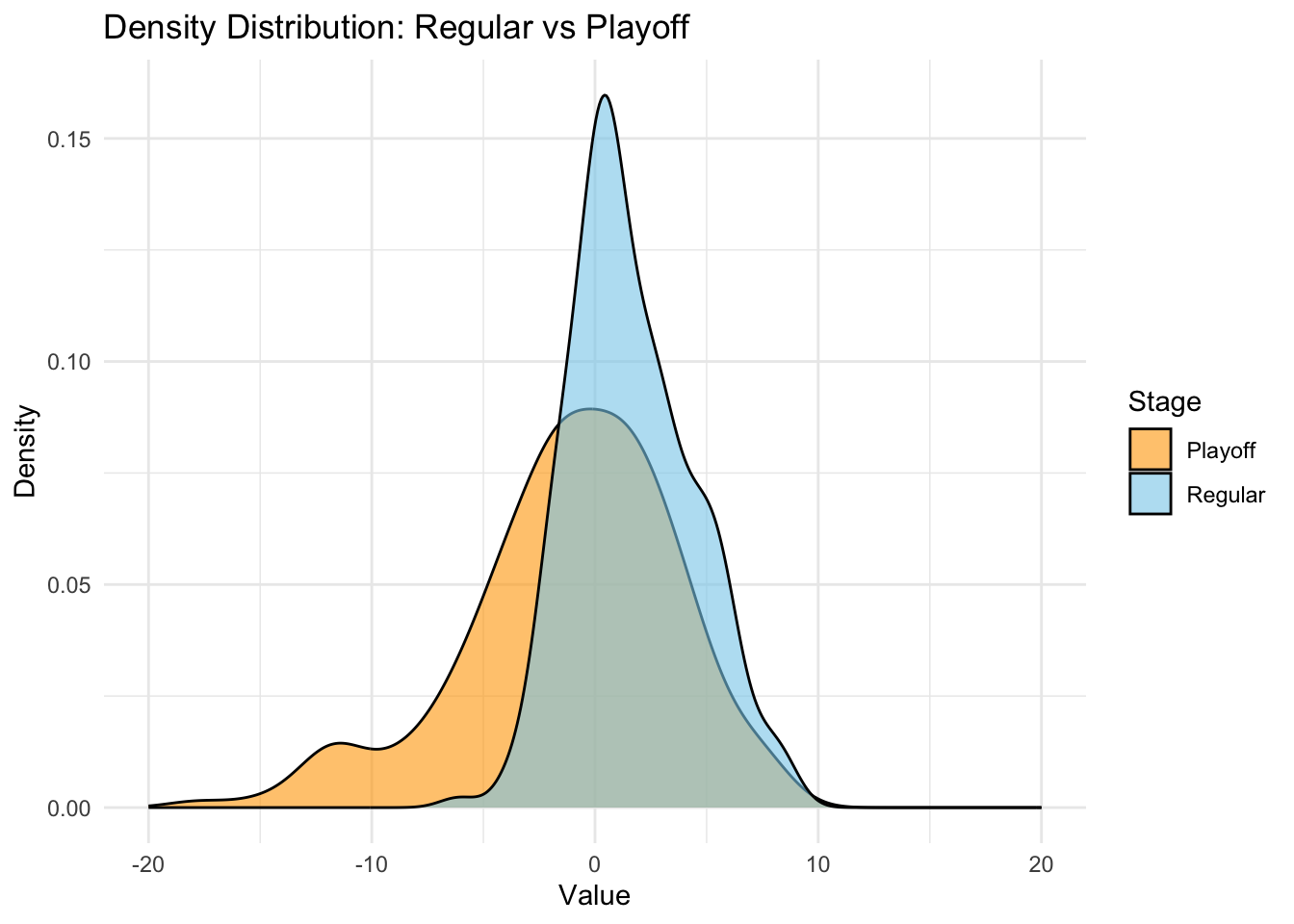
This graph shows the distribution of NBA players’ “+/-” value. This attribute means: his team will win/lose how many points when the player is playing on the court. If the value is negative, it means when he is on the court playing, the team is losing in average. If the value is positive, it means when he is on the court playing, the team is winning in average. This feature shows players performance to some extent.
Analysis: The distribution for regular season is narrower with a higher peak, which indicates that most values are concentrated within a smaller range, and most value lie around 0. Moreover the distribution is right-skewed. The data for regular season is mostly confined between -5 and 10. The distribution for playoff season is wider with a lower peak, which indicates that data is more dispersed. The playoff data also have the peak near 0, but the distribution is less concentrated and left-skewed. Its wider distribution indicates that values can be more extreme in both positive and negative directions. The data for playoff season has a broader range, from -15 to 10.
Possible Interpretations: The distribution for both regular and playoff season show that most players on average have a “+/-” value around 0. This indicates that, on average, most players have a neutral impact on their team’s scoring margin when they are on the court. The regular season data distribution may indicate that games are less intense, therefore player have similar “+/-” value rather than many extreme value. The difference among players is small. The Playoff season data distribution may indicate games are more competitive, since the difference among players are larger. It also shows some players play very well while others struggle against other team, which can give us more insight about the differences in player performance levels.
filtered_data <- filtered_data |>
  select(-contains("X..."))

average_data <- filtered_data |>
  summarise(
    across(ends_with("_Regular"), mean, na.rm = TRUE),
    across(ends_with("_Playoff"), mean, na.rm = TRUE)
  ) |>
  pivot_longer(
    cols = everything(),
    names_to = c("Metric", "Stage"),
    names_pattern = "(.*)_(Regular|Playoff)",
    values_to = "value"
  )

ggplot(average_data, aes(x = Stage, y = value, fill = Stage)) +
  geom_bar(stat = "identity", position = "dodge") +
  facet_wrap(~ Metric, scales = "free_y") +  # 按 Metric 分小图
  labs(
    title = "Average Performance: Regular vs Playoff",
    x = "Stage",
    y = "Average Value"
  ) +
  scale_fill_manual(values = c("Regular" = "skyblue", "Playoff" = "orange")) +
  theme_minimal() +
  theme(axis.text.x = element_text(angle = 45, hjust = 1))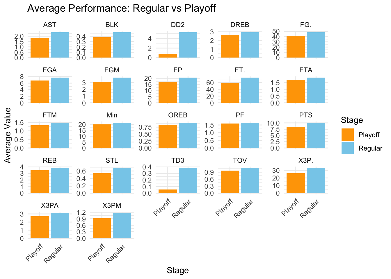
This graph show a comparison between performance teams in regular season and performance of teams in playoff seasons. To be specific, there are 30 teams in regular seasons but only 16 can go to play the playoffs according to their ranks (8 in the West Conference and 8 in the East Conference).
Features analysis: Feature with significant difference: Double Double (DD2), Triple Double (TD3): Double Double means a player have and two of these stats points, rebounds, assists, and steals that over 10 in one game is a double double. Triple double means player should have any three of the stats over 10 in one game. We can see these two features show how all-around a player is. In the graph we can clearly see that the average of DD2 and TD3 is significantly decreased. This show that it is hard for player to achieve DD2 or TD3 in playoffs, which indicates the game in playoffs is more intense.
Features with slight difference: Turnovers (TOV): Players tend to have slightly higher turnovers during the Playoffs compared to the Regular Season. This is may because in playoffs, players have increased defensive pressure and the game is more intense than regular season.
Points (PTS), Fantastic Point (FP): Average scoring is slightly lower during the Playoffs, which also shows players have increased defensive pressure and the game is more intense than regular season. Fantastic point is an indicator of how positive effect does a play have on the court.
Shooting Performance (FGA, FGM, FG., X3P., X3PA, X3PM): Regular Season shows higher field goal percentage (FG.) and three-point percentage (X3P.). However, the Playoffs we can see an decrease in shot attempts (FGA) and three-point attempts (X3PA) and the shooting percentage is also lower. This indicates increased defensive pressure in the Playoffs.
Assists (AST), Rebounds (REB), Blocks (BLK), and Steals (STL): These features show a slight decrease from Regular to Playoff seasons, also give an insight that players the game is more intense.
Free Throw Percentage (FT.) Regular Season shows higher Free Throw Percentage (FT.). Free throws really require precision, focus, and mental stability under pressure.Therefore, this difference is more intuitive to show that playoffs game is more intense and players are under more stressed and are more tired.
regular <- read.csv("data/NBA_team_2023-2024csv.csv")
playoff <- read.csv("data/NBA_team_playoffs_2023-2024csv.csv")
west_teams <- c(
  "Denver Nuggets", "Oklahoma City Thunder", "Minnesota Timberwolves",
  "LA Clippers", "Dallas Mavericks", "New Orleans Pelicans",
  "Phoenix Suns", "Los Angeles Lakers", "Golden State Warriors",
  "Sacramento Kings", "Houston Rockets", "Utah Jazz",
  "Memphis Grizzlies", "Portland Trail Blazers", "San Antonio Spurs"
)

east_teams <- c(
  "Boston Celtics", "New York Knicks", "Milwaukee Bucks",
  "Cleveland Cavaliers", "Indiana Pacers", "Orlando Magic",
  "Philadelphia 76ers", "Miami Heat", "Atlanta Hawks",
  "Brooklyn Nets", "Charlotte Hornets", "Toronto Raptors",
  "Washington Wizards", "Detroit Pistons", "Chicago Bulls"
)

# 添加东西部分类
regular <- regular %>%
  mutate(
    Region = case_when(
      Team %in% west_teams ~ "West",
      Team %in% east_teams ~ "East",
      TRUE ~ "Unknown"
    )
  )
playoff <- playoff %>%
  mutate(
    Region = case_when(
      Team %in% west_teams ~ "West",
      Team %in% east_teams ~ "East",
      TRUE ~ "Unknown"  # 未知球队可标记为 Unknown
    )
)plot_data <- regular %>%
pivot_longer(
cols = W:PFD,
names_to = "Metric",
values_to = "Value"
)
ggplot(plot_data, aes(Region, y = Value, fill = Region)) +
geom_boxplot() + # 分组柱状图
facet_wrap(~ Metric, scales = "free_y") + # 按变量分面
labs(
title = "East vs West Comparison by Metric and Season Type",
x = "Region & Season Type",
y = "Value"
) +
scale_fill_manual(values = c("East" = "blue", "West" = "orange")) +
theme_minimal() +
theme(
axis.text.x = element_text(angle = 45, hjust = 1), # 旋转 x 轴标签
strip.text = element_text(size = 12, face = "bold") # 加粗分面标题
)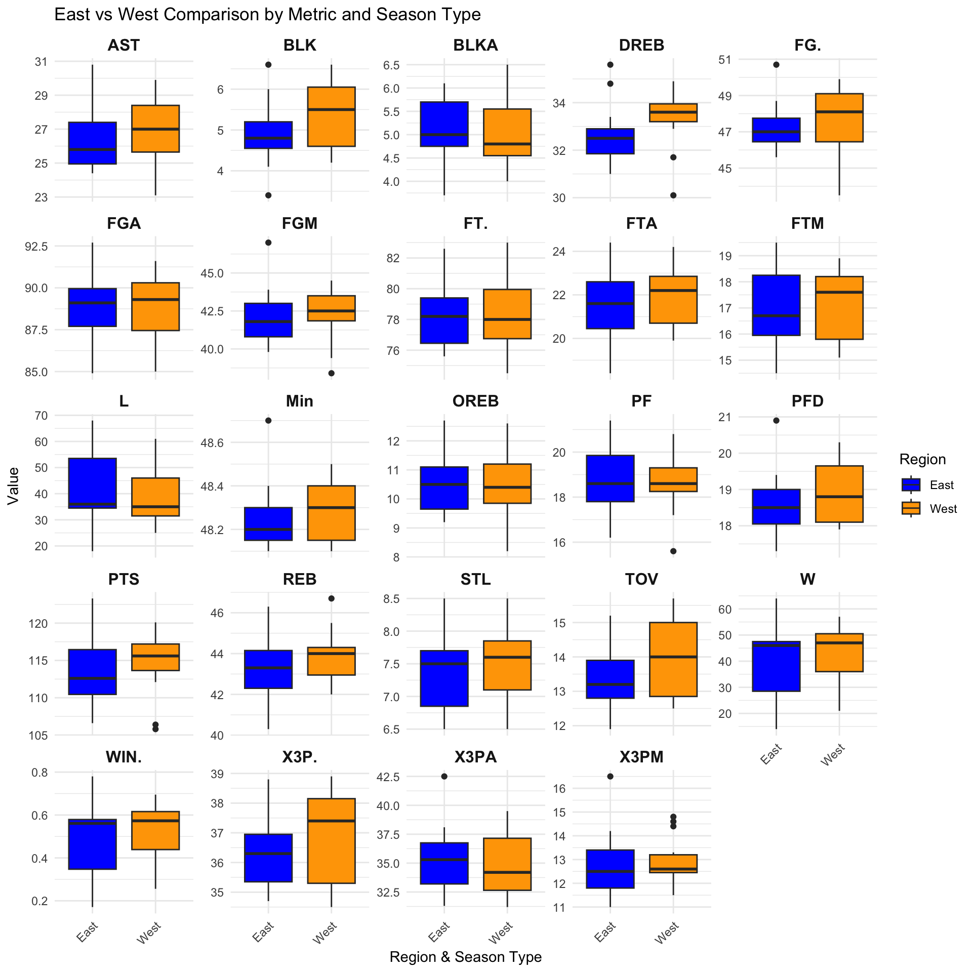
This graph show a comparison between teams in West and teams in East.
Wins (W):
The West shows a higher median for wins, which indicates west teams has stronger performance overall.
Points (PTS):
Teams from the Western Conference tend to score more points on average, since the median is high. Moreover, for the east team, they have a larger spread for points scored. This may show that most west teams focus more on getting more points, while some of east teams get less points on average, either showed they are slight worse or they focus more on defense.
Field Goal Percentage (FG.):
The Western Conference also has a slightly higher FG%, which indicate they have a better shooting efficiency. However, the west teams have larger spread in this feature, which showed that west teams performance is quite different. Moreover, there is an outlier in the east, which may indicate there is a really good team in the east which has large performance gap between itself and other east teams.
Three-Point Shooting (X3P., X3PA, X3PM):
The East shows higher medians for three-point attempts (X3PA) but makes similar (X3PM). This suggests that although East teams rely more on three-point shooting, they are not that efficient compared to the West. The three-point percentage (X3P.) is slightly higher in the West. This mean the West is more efficient in three-point but the East often attempt more three-point.
Assists:
It shows generally West team has more assits in one game, which shows they may have more pass in the game. This result is consistent with turnovers (TOV).
Free throw (FT., FTA, FTM)
The graph shows that the difference of free throw percentage (FT.) is quite similar, but West has more free throw made (FTM) and free threo attempt (FTA). This may indicate that West teams has the style which is more physical.
Other features like offensive rebound (OREB), shows similar stats.
Turnovers (TOV):
The East has slightly fewer turnovers on average, which may indicate the East teams are more conservative while the West team has more pass which leads more turnovers.
Defensive Rebounds (DREB):
The west has significantly more defensive rebound, which may show that west team generally has better defence.
In conclusion, the west team generally show a better offence and defence, which make them stronger than east teams overall. However, we can see there some outliers in East graph, which indicates there may be a very strong team in East.
regular_player <- read.csv("data/NBA_players_2023-2024csv.csv")
regular <- read.csv("data/NBA_team_2023-2024csv.csv")

# 创建完整的球队名称和简称映射表
abbreviation_data <- tibble(
  Team = c(
    "Atlanta Hawks", "Boston Celtics", "Brooklyn Nets", "Charlotte Hornets", "Chicago Bulls",
    "Cleveland Cavaliers", "Dallas Mavericks", "Denver Nuggets", "Detroit Pistons",
    "Golden State Warriors", "Houston Rockets", "Indiana Pacers", "LA Clippers",
    "Los Angeles Lakers", "Memphis Grizzlies", "Miami Heat", "Milwaukee Bucks",
    "Minnesota Timberwolves", "New Orleans Pelicans", "New York Knicks",
    "Oklahoma City Thunder", "Orlando Magic", "Philadelphia 76ers", "Phoenix Suns",
    "Portland Trail Blazers", "Sacramento Kings", "San Antonio Spurs",
    "Toronto Raptors", "Utah Jazz", "Washington Wizards"
  ),
  Abbreviation = c(
    "ATL", "BOS", "BKN", "CHA", "CHI", "CLE", "DAL", "DEN", "DET",
    "GSW", "HOU", "IND", "LAC", "LAL", "MEM", "MIA", "MIL",
    "MIN", "NOP", "NYK", "OKC", "ORL", "PHI", "PHX",
    "POR", "SAC", "SAS", "TOR", "UTA", "WAS"
  )
)

team_data <- regular %>%
  left_join(abbreviation_data, by = "Team")
# 从球员数据中找到每支球队的 FP 前两名球员,并计算平均值
top_fp_avg <- regular_player %>%
  group_by(Team) %>%                # 按球队分组
  slice_max(FP, n = 2, with_ties = FALSE) %>%  # 找到 FP 最高的两名球员
  summarise(avg_fp_top2 = mean(FP, na.rm = TRUE), .groups = "drop")  # 计算前两名的平均值

team_data <- team_data %>%
  left_join(top_fp_avg, by = c("Abbreviation" = "Team"))

#write.csv(team_data, "team_data_fp.csv", row.names = FALSE)ggplot(team_data, aes(x = avg_fp_top2, y = W)) +
geom_point(size = 3, color = "blue", alpha = 0.7) + # 散点图
geom_smooth(method = "lm", se = TRUE, color = "red") + # 拟合曲线(线性回归)
labs(
title = "Relationship Between Top 2 Fantasy Points and Wins",
x = "Average Fantasy Points (Top 2 Players)",
y = "Number of Wins"
) +
theme_minimal() +
theme(
plot.title = element_text(size = 16, face = "bold"),
axis.title = element_text(size = 14)
)`geom_smooth()` using formula = 'y ~ x'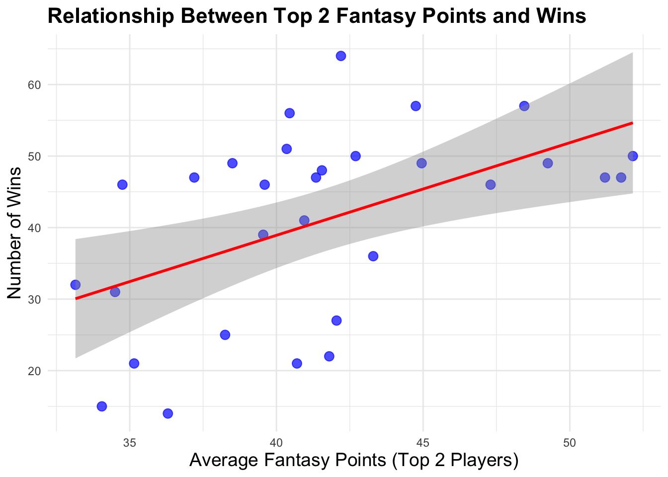
Description: In this graph, I first found two players of each team who have the top 2 fantastic points in their team, and I want to see the relationship between the average fantasy points of top 2 players in each team and the num of winning games.
analysis It showed that generally, these two stats are positive correlated. This kind of makes sense since if their core players are better, their team tends to be better. However, we know that basketball is team sports. so there are some teams that has high fantasy points of their core players, but other player may not have a big role, which cannot make team win.
# 筛选需要的变量
selected_team_data <- team_data %>%
  select(PTS, REB, AST, TOV, STL, BLK, X3PM, FGM,FTA) %>%
  na.omit()


# 运行 PCA
pca_team_result <- prcomp(selected_team_data, scale. = TRUE)

# 提取主成分得分
pca_team_scores <- as.data.frame(pca_team_result$x)
pca_team_scores$Team <- team_data$Abbreviation # 添加球队名称

# 提取变量加载向量
team_loadings <- as.data.frame(pca_team_result$rotation)

ggplot(pca_team_scores, aes(x = PC1, y = PC2)) +
  geom_point(size = 3, color = "blue", alpha = 0.8) +  # 球队散点
  geom_text(aes(label = Team), vjust = -1, size = 3.5) +  # 标注球队名称
  geom_segment(data = team_loadings, aes(x = 0, y = 0, xend = PC1 * 5, yend = PC2 * 5),
               arrow = arrow(length = unit(0.2, "cm")), color = "red", inherit.aes = FALSE) +
  geom_text(data = team_loadings, aes(x = PC1 * 5, y = PC2 * 5, label = rownames(team_loadings)),
            color = "red", size = 4, vjust = 1.2, hjust = 1.2, inherit.aes = FALSE) +
  labs(
    title = "PCA of Teams with Variable Loadings",
    x = "Principal Component 1 (PC1)",
    y = "Principal Component 2 (PC2)"
  ) +
  theme_minimal()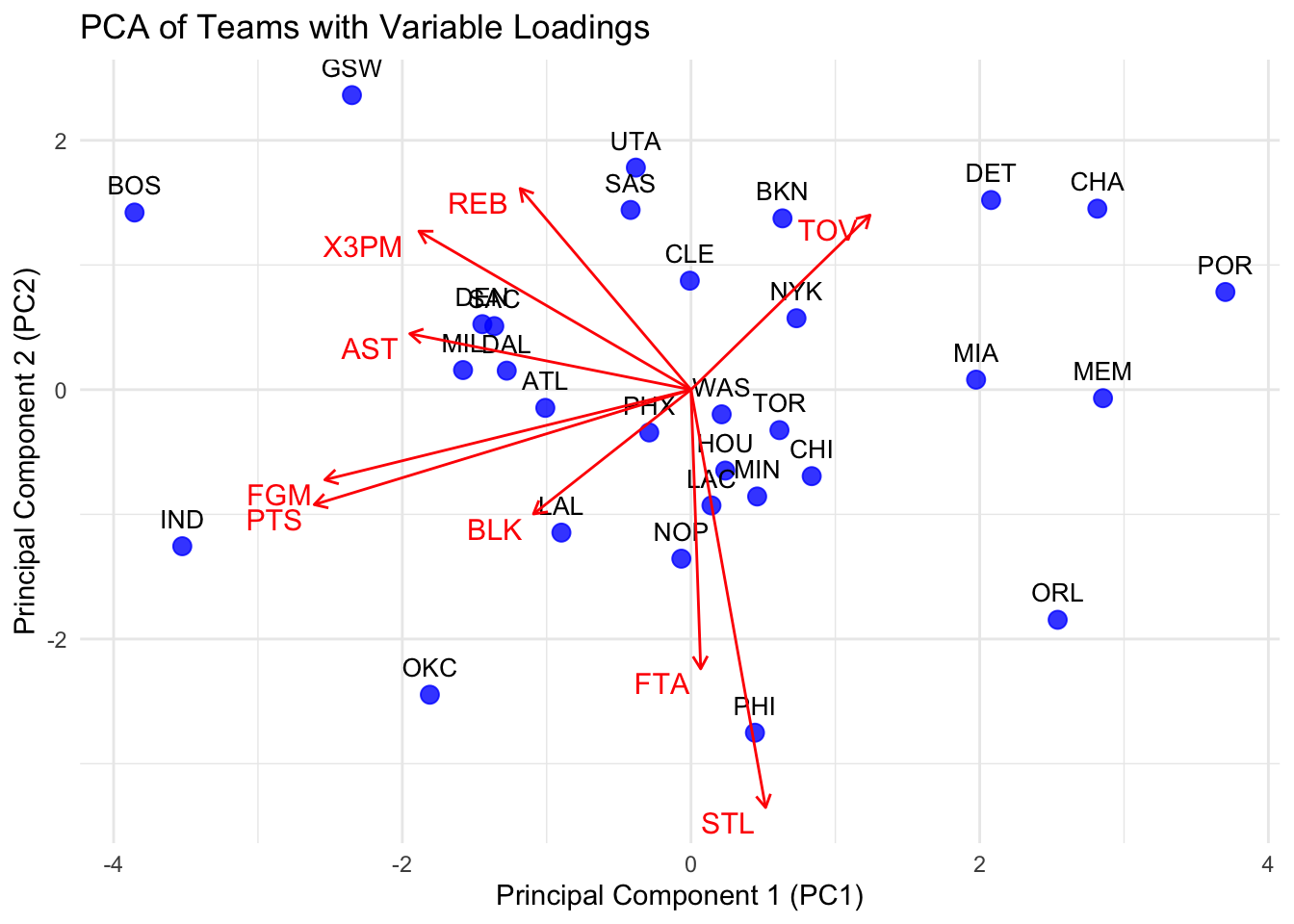
PC1 (x-axis): It reflects more about offensive metrics such as Points (PTS), Assists (AST), three-point made (X3PM), and Field Goal Attempts (FGA), because these variables have strong positive loadings along this axis. PC2 (y-axis): It reflects more about by Turnovers (TOV), Steals (STL), and Free Throw Attempt (FTA).
This graph can help us know what is the style of each team and whether these teams are good or not. Here are some teams with specific styles.
GSW (Golden State Warriors): The team lies at the top-left quadrant. GSW aligns with Three-Point Attempts (X3PA) and Turnovers (TOV), which may indicate their high-risk but high-reward offensive strategy and they mainly do the offence by three-point shooting.
PHI (Philadelphia 76ers): It is at the bottom-right quadrant. PHI aligns with Free Throw Attempt(FTA), Steal (STL), which may indicate they focus on defense and play very physically to get free throws.
OKC (Oklahoma City Thunder): It is at the bottom-left quadrant. OKC has a more balanced style with lower reliance on three-point shooting and turnovers. Moreover It points (PTS), assists (AST), and steal (STL) are all quite high, which means they are good on both deffense and offence.
CHA and POR: They are at the top of the chart, these teams tend to have more turnovers and less points. This may indicate they have poor performance this season.